Monday, July 20, 2009

Paper architecture and perspective

It is quite amazing what you can do with paper and a little imagination. Any fantasy landscape or building can be constructed to understand space and perspective. Students constructed their own "buildings" and gave them names then did a drawing each.

Above: "Batman's Ears"
Below: "Log Cake"


Sunday, August 26, 2007

Checklist for Paper 2

Investigation and Interpretation of Theme [25 Marks]

Investigation (2 – 3 marks each)
1. Mind map that shows creativity and linking of ideas in a surprising way.

2. Your 10 to 15 sketches (with captions) show variety, cover wide aspects of your
theme and reflect what is in your mind map.

3. Your sketches are detailed with a variety of tones and done in pencil, colour
pencil, pen, paint, mixed media, pastels, etc.

4. You are inspired by an artist’s or designer’s work (paste a small picture of the art work) and are able to say what you find interesting about the artist (e.g. colour scheme, brushwork, ideology, style, subject matter, etc). You may use more than 1 artist.

5. You have taken your own photographs or made sketches from real life. The photographs show an original and highly personal approach to the theme. You paste no more than 1 or 2 photographs in your prep work.

Interpretation or Development (2 – 3 marks each)
1. You take your sketches and redraw or paint them using some of the following tools:
Simplification, Magnification, distortion, segmentation, morphing, repetition, filling with shapes, filling with lines, overlapping, adding texture, changing colours, stylization, adding pattern, using dynamic brushwork, etc.

2. Your development supports the ideas, emotions and mood of your theme (e.g. distortion can be used to reinforce the idea of anger, solitude or fear).

3. You combine relevant images together to form 6 to 8 different layouts. The layouts show your ability to approach your theme from many different perspectives.

4. Your layouts are coloured using different medium and some done in the style of your inspiration artist. Choose 1 of these layouts to paint as a practice piece.

5. Your layouts have captions and comments to explain your developmental process.


The Aesthetic Qualities of your painting [25 Marks]

The Visual quality of your painting (up to 12 marks each)
1. In all your sketches, development, layouts and colour studies, you used the following elements of art (EOA) to reinforce your theme:
Line, shape, tone (contrast), texture, colour, space (or perspective)
(e.g. A painting about fear may have thick, sharp lines with dark colours and high contrast)

2. You have employed one or all of the following Principles of Design (POD) to enhance your layout:
Balance, Movement, Rhythm, Contrast, Emphasis (area of focus), Pattern, Positive and Negative space, Unity and Variety
PODs make your layout interesting, pleasing or exciting to the viewer.

3. Minus marks if you have any of the following in the final work:
· Unpainted surfaces
· A final layout that is too cluttered and has no area of focus
· A incomplete or flat background
· Minimal blending of colours with paint used straight from the tube
· Boring flat areas of colour
· Outlines in marker pen
Any elements that do not appear in your prep work as well

4. You arrange your prep work in a neat but dynamic manner using some PODs. Each section is clearly labeled and all your captions/comments are legible. (2m)

5. The importance of colour:
Colour can enhance your painting greatly and can help you to score more marks even if you did not use any EOA or PODs.
1. Make use of colour schemes to reinforce your ideas
· Cool colours like green, blue and indigo (bluish purple)are calming, sad or moody
· Warm colours like cadmium red, orange, yellow and violet (reddish purple) are energetic, explosive and happy
· Colours can also be grouped according to SPRING (pastels and yellowish greens), SUMMER (strong warm primary colours and deep greens), AUTUMN (yellow ochre, orange, earthy browns and olive greens) and finally WINTER (light blues, grey tones, black and white).
· Analogues: colours next to each other on the colour wheel
2. To make your colours “pop”, use small strokes/patches of complimentary colours amongst the main colour (e.g. a few strokes of orange within mostly blue tones).
3. Emphasis can be created by using an unequal proportion of complimentary colour.
4. Even in a mostly black and white painting, using colours in small amounts will create emphasis.
5. Colours have different values and if converted to black and white can create different tones. Make sure you have a variety of tones in your colours throughout the painting.


Control of Materials and Technical Processes [25 Marks]

Drawing and Painting skills
1. In whatever media you use, you are confident and effective.

2. Your drawing and painting techniques reflect your personality and personal style.

3. Your sketches, development and colour studies are vibrant, dynamic and suit your theme.

4. You show confidence in the way you create tones with the medium.

5. You show an understanding of how different painting techniques can affect the meaning of your work. (e.g. thinly applied paint can suggest a distant landscape, thick impasto can suggest movement and rhythm)


Personal Response [25 Marks]

The depth of your involvement in your preparatory studies and final artwork (3m each)
1. You took your own photographs during the research process.

2. You have a wide range of research sketches and in different media.

3. Your whole research and development process is original, inventive, and spontaneous. At the same time conveys your ideas effectively.

4. You have an artist statement/poem/mind-map summary/mood board that states your journey, message or ideas about your theme.

5. You have documentation of your artistic journey from research to final work. This can include captions, poems, photographs, pictures, diary entries, words by others, etc.

6. You showed a high level of personal involvement through curiosity, engagement with your research sketches, exploration of many different ideas in the treatment of the sketches and incorporation of other artist’s artwork into your own.

7. The prep work and final work shows your personality, interests and beliefs.

8. You have a statement about what you learned/your conclusions about your artwork.


Example of Paper 2 prep: Abandoned


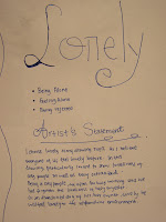
Example of Paper 2 prep: Lonliness


This student looked at "lonliness" from the view that places,
situations and even animals can make you lonely. For
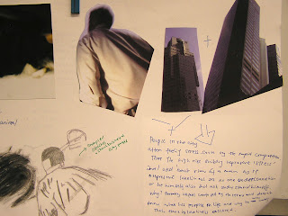
example, a lonely day at the beach, working in the city can make you feel alone,
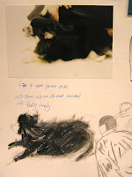
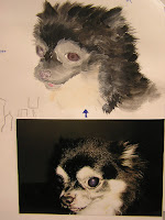
an abandoned dog in a dark stairwell.


Also the idea that bare feet represent the honest soul of a pitiful human being.


In her development she started to experiment with putting the feet floating above the city...


The crab looking on at one person isolated from a crowd of others.


The busy executive feels very small and isolated from other human contact.


Here are the beginnings of some colour studies. The student did not have enough time to do proper colour studies which, should have been painted or coloured with colour pencils.
Other ideas for development she could have used include distortion, using scale (big and small) to change the relationship between objects, merging one object into another, playing with paint techniques, using mixed media, even simplifying the shapes and forms of the objects.


Below is the final work. This work could have been improved if there was better use of colour to create various tones. In her colour studies, she could have experiemented with symbolic colour. There is also not enough mixing of colour, much of it is paint squeezed directly from the tube (eg. the red and green buildings).
A successful piece of work will make use of the elements of art as well as make use of the principles of design. Overall, the prep and final work are moderately successful because there is a flow of thought. The examiner can see how the student has arrived at the final idea.


Sunday, February 25, 2007

COLOUR, COLOUR, COLOUR

I cannot stress enough how important colour is in your coursework and paper 2. Use these links to find out more:
http://www.infoplease.com/spot/colors1.html
http://www.luminous-landscape.com/tutorials/colour_theory.shtml
http://www.colour-affects.co.uk/psyprop.html

To see the application of colour in our lives:
http://83.168.206.163/webbizz/mainPage/main.asp

Different colours have different intensity. Ideally you should have a balance of light, dark, strong and muted colours:
http://www.modernlifeisrubbish.co.uk/article/web-2.0-colour-palette

Remember:
  1. Effective colour schemes can strengthen the concept of your artwork Eg. Themes that deal with war, destruction and fear use a lot of red, black, brown. Themes that deal with happiness, festivals use bright bold colours.
  2. Warm or bright colours push things forward and cool or muted colours make things appear to go backwards.
  3. Try not to make your artwork a rainbow with equal amounts of every colour. Instead, use contrasting colours in unequal proportion. Eg. If you have a lot of blues, greens and purples, a small amount of orange and red will make your painting stand out.

Paper 2: Standard of final work

Here are examples of good Drawing and Painting final works:

Colour Personality Test

Humans have a strong response to colour. It is strongly linked to our emotions and personality. Take this quiz:

http://www.colorquiz.com/